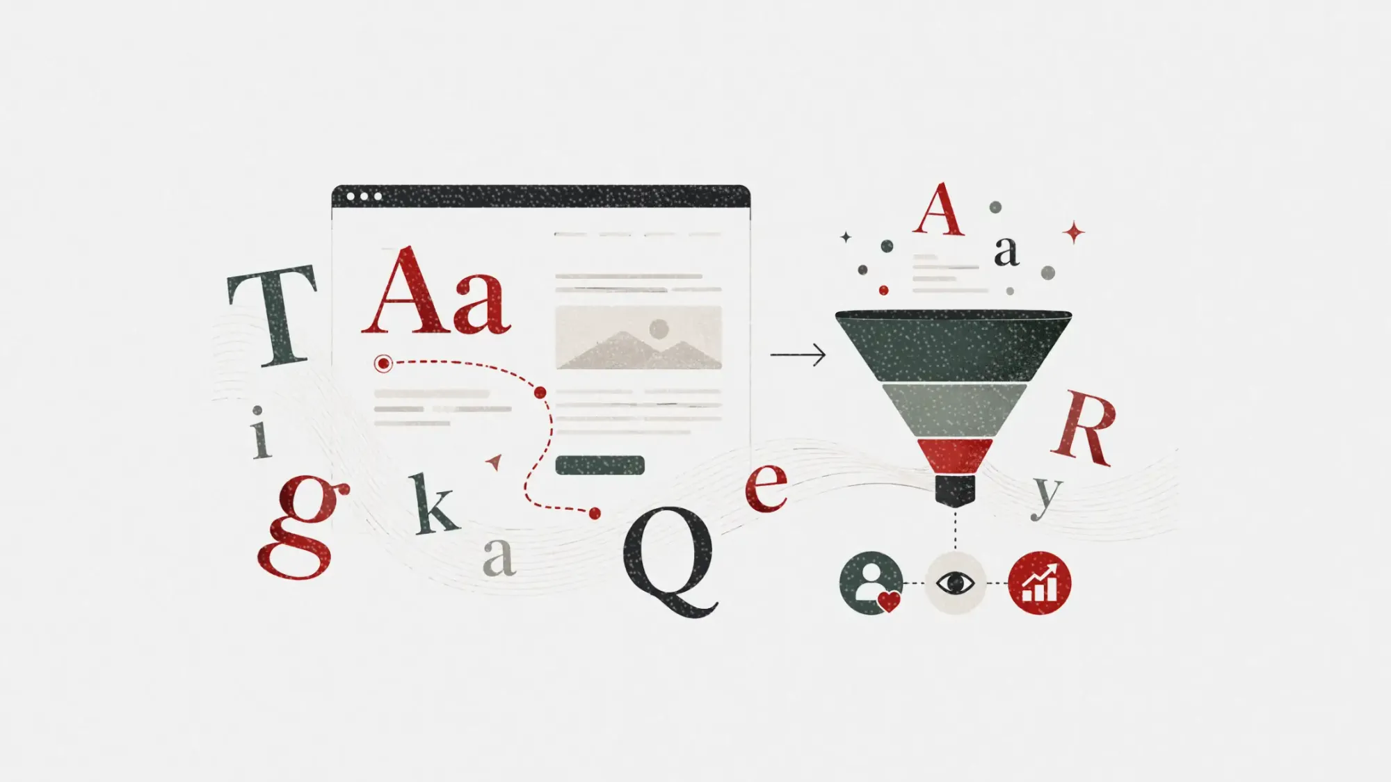
Typography choices often feel like background decisions in digital marketing. Most teams default to familiar fonts like Arial, Tahoma, or Times New Roman without questioning how those choices shape readability, trust, and user experience.
But according to new research from digital design studio Kraam, some of the internet’s most commonly used fonts may actually be undermining engagement and brand perception. The study evaluated popular fonts across readability, spacing, structural consistency, and visual clarity, revealing how seemingly harmless typography decisions can quietly weaken website performance.
For marketers, this is more than a design debate. Typography affects scanning behavior, perceived professionalism, conversion rates, and how long visitors stay engaged with content. In crowded digital environments where every second of attention matters, poor font choices can become an invisible friction point.
Table of contents
Jump to each section:
- What Kraam’s font research reveals about digital readability
- Why familiar fonts still create problems for marketers
- What marketers should know about typography and user experience
- Why typography is becoming a branding and conversion issue
 ContentGrip Staff
What Kraam’s font research reveals about digital readability
Kraam’s design team analyzed several widely used fonts using five core criteria:
- Proportions and readability
- Stroke consistency
- Apertures and spacing
- Distinguishability between characters
- Structural consistency
Each font received a score out of 50 based on how effectively it supports readability and digital usability.
The lowest-performing font was Arial Narrow, which scored 30/50 due to its compressed structure and cramped spacing. According to Kraam, tightly packed characters create scanning friction, especially on smaller screens where letters can visually blur together.
Microsoft Sans Serif followed closely behind at 31/50, with researchers highlighting its outdated rendering and lack of visual refinement. Century Gothic, Tahoma, Arial, and Trebuchet MS also ranked poorly because of spacing inefficiencies, heavy visual density, or inconsistent character rhythm.
Even traditionally respected fonts like Times New Roman, Verdana, and Georgia received criticism for their digital limitations. While readable in print or editorial settings, these fonts can feel visually dated or inefficient in modern web interfaces.
Candara ranked highest among the reviewed fonts with 39/50, though Kraam still described it as lacking strong visual identity or hierarchy support.
The broader takeaway is clear: readability is no longer just a design preference. It directly affects usability, attention, and engagement.
Why familiar fonts still create problems for marketers
Many of the fonts criticized in the study remain deeply embedded across websites, presentations, email templates, and internal brand systems. That familiarity creates a hidden problem for marketers.
System fonts like Arial or Times New Roman often feel “safe” because they are recognizable and universally available. But according to Kraam’s findings, that comfort can come at the cost of differentiation, readability, and modern user expectations.
On websites, typography affects how quickly users scan content, process information, and decide whether a page feels credible. Dense text blocks or visually generic fonts can reduce engagement without users consciously realizing why.
This matters even more as marketing teams compete for attention across mobile devices, landing pages, newsletters, and social content.
Kraam’s senior designer Keith Blues explained the issue directly” “Typography is one of the most important parts of digital design because it directly affects how people consume information. If text is hard to read or feels visually off, users won’t spend time figuring out why. They’ll just disengage.”
For marketers investing heavily in performance optimization, this creates an uncomfortable reality. Teams may spend months refining messaging, seo strategy, ad targeting, and conversion funnels while overlooking typography choices that quietly reduce usability.
What marketers should know about typography and user experience
The study highlights several practical lessons for marketers and brand teams reviewing their digital experiences.
1. Prioritize readability over familiarity
Fonts that feel traditional or universally available are not always optimized for modern screen behavior. Marketers should test typography across devices, screen sizes, and content formats rather than defaulting to legacy system fonts.
2. Avoid condensed fonts for body copy
Compressed fonts like Arial Narrow may save space visually, but they often reduce readability and scanning speed. For long-form content, newsletters, or landing pages, open spacing and clear letterforms typically improve comprehension and engagement.
3. Treat typography as part of brand positioning
Typography influences perceived professionalism and trust. Minimal effort font choices can unintentionally make a brand feel outdated, generic, or visually inconsistent compared to competitors. Strong typography systems help reinforce tone, hierarchy, and brand identity across channels.
4. Build consistency across digital touchpoints
Kraam also emphasized the importance of maintaining consistent typography structures across websites and interfaces. Inconsistent type systems can weaken visual hierarchy and create friction between user interactions.
This is especially important for brands operating across multiple campaigns, landing pages, and content ecosystems.
Why typography is becoming a branding and conversion issue
Typography discussions traditionally lived inside design teams. Now they are becoming part of broader marketing and conversion conversations.
As digital experiences become increasingly crowded, brands are under pressure to reduce friction wherever possible. Small usability improvements can influence bounce rates, time on page, lead generation, and overall brand trust.
Typography sits directly inside that equation.
Modern marketing teams are also operating in environments where brand identity must remain consistent across websites, AI-generated content, paid ads, mobile apps, and email campaigns. Fonts are no longer just aesthetic choices. They shape how fast users process information and how credible a company appears.
The rise of AI-generated content may further increase the importance of typography. As more brands publish similar-looking content at scale, visual differentiation and readability could become stronger competitive advantages.
For B2B marketers in particular, typography can quietly influence whether a landing page feels premium, trustworthy, or outdated. Brands that treat readability and visual hierarchy as part of their marketing strategy will likely create stronger user experiences than competitors still relying on default design habits.